Dialogue Boxes
|
Dialogue Boxes
|
|
|
|
|
SummaryThis chapter details the construction, types, functions and uses of 3B2 dialogue boxes. |
1 |
Introduction |
|
A dialogue box appears on the screen to present information or request input. Typically, dialogue boxes are temporary; they disappear once the user has entered the requested information and clicked |
Dialogue boxes in Arbortext APP are extremely extensive and the information provided to understand them ranges from basic to very complex. Consequently, this chapter is divided into three sections:
|
2 |
Basic Section |
2.1 |
Basic dialogue box components |
|
All dialogue boxes are defined by numbered strings or within a documents stream. Dialogue box content items can be defined either in internal Arbortext APP streams or external strings files and are invoked using macros, which either call the internal stream or the string number assigned by the external string file. |
|
More information on Arbortext APP string files, string numbers and scripts can be found in the 3B2 Scripting chapter. |
The main macros used for creating dialogue boxes are:
|
 |
The twdb macro simplifies dialogue box creation. It uses the contents of a stream to create a dialogue box without having to use defstr and addstr to define and add strings. For more information see twdb. |
 |
It is recommended that you read the basics of this chapter before commencing development of your first dialogue box. |
The basic elements of a dialogue box are:
|
|
The above elements will be described throughout this section. |
2.2 |
Basic dialogue box script example |
|
The internal script stream below includes all the basics required for a simple dialogue box: |
|
|
|
|
|
|
|
|
|
|
|
|
|
|
|
|
|
|
|
|
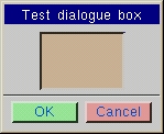
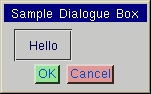
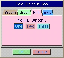
The above script will output this dialogue box: |
 |
2.3 |
Dialogue Box Interaction |
2.3.1 |
General edit fields and lists |
As described in the previous section, there are many edit fields that can be incorporated into dialogue boxes including:
|
|
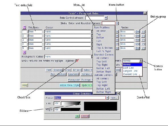
Lists are one of the fundamental features of a dialogue box. There are many variations such as general picking lists, menu lists and combo box lists. They are all explained further in the Intermediate Section of this chapter but a quick overview is given here. The screenshot of the Paragraph Rules dialogue box below details the different components of a dialogue box: |
 |
|
|
 |
|
|
 |
2.3.2 |
Enter and Tab keys |
|
The Tab , Tab + Shift and Enter keys can be used to interact with a dialogue box as described below: |
|
2.3.3 |
Selecting text in edit fields |
|
Clicking in an edit field will select all the text that has been entered, unless the 'n' option (see Labelling editable field items section) has been used which does not clear the field when you type. Subsequent clicks enable you to place the cursor at a specific point in the line and dragging the cursor over the characters will select it accordingly. When double clicking in a field, the whole field will be selected. |
2.3.4 |
Cut copy and paste |
|
The cut, copy and paste functions work in edit fields by using the following keys: |
|
|
With Windows versions of Arbortext APP these functions interact with the Windows clipboard. |
2.3.5 |
Keyboard mode |
|
A keyboard mode has been added to the dialogue box interface options. By default, the cursor Home and End keys do not affect the mouse controls but instead always affect the cursor within the current edit field. The former mode, when the mouse controls can be turned on, is specified in Arbortext APP's Interface Options dialogue box under the |
|
Below is a list of keystrokes that can be used in dialogue boxes: |
|
2.3.6 |
Exiting a dialogue box |
|
The most common way for the user to exit a dialogue box is to click on an exit button, such as |
|
%2..1e OK Cancel |
|
Arbortext APP's standard dialogue box shortcuts can be used to exit a user-defined dialogue box, therefore it is important to understand how the shortcuts return values to the ^wdb variable. |
|
The user can exit a dialogue box by pressing Ctrl + A , pressing Enter in an exit field, a field with the x option appended to the field type or pressing any key if the dialogue box contains a ~ (tilde) character to indicate that any key can be used to exit (see Keyboard exit from a dialogue below). These three methods of accepting a dialogue box always give the ^wdb variable a value of 1. |
|
|
|
A user-defined dialogue box should be constructed so that the %1e field carries out some sort of Cancel or Quit function. There should also be a way of processing ^wdb variables with a value of -1 so that the user can carry on using Arbortext APP's keyboard shortcuts without anything unexpected happening. |
2.3.6.1 |
Keyboard exit from a dialogue box |
|
If there are no edit fields to receive typed characters in a dialogue box, you can allow the user to exit by pressing any key. A value of -1 will be returned to the ^wdb variable. This is done by including the ~ character anywhere in the string (usually at the front) for example: |
|
defstr 390, "~|Dialogue box title\n" |
2.3.6.2 |
Processing the wdb variable |
|
The sample script below defines a simple dialogue box which contains three exit buttons, which will pass values of 3..1 to the ^wdb variable. Clicking on |
|
|
|
|
Suppose the user has pressed OK or Ctrl + A . Below is a description of what Arbortext APP would do:
|
|
3-1=2 |
|
This saves implimenting a multiple jump sequence. |
2.3.7 |
Dialogue box titles |
|
All dialogue boxes have a title by default, which is a blue bar with white text (colours 155 and 156 respectively as defined in the scol256c.3ad file). When a second dialogue box pops over the top of the current one, the title background will switch to 50% grey (colour 157), until it is reactivated. |
|
The dialogue title is simply the first line of the dialogue box script, up until the first return character. If a separator line is required then it must be defined on a separate line. |
|
The main title has certain criteria. It is not allowed any % item in it. If a percent item is present, then no title will be given to the dialogue box. Also if a '[' bracket is encountered in the title, the dialogue box will be without a title. |
|
If no title is required, a thin blue bar across the top of the box can be obtained by entering two dashes as the characters in the title string. |
|
Starting the dialogue box with a return is the default way to skip any title. |
|
The title is the same width as the dialogue box. It will be formatted in the normal way, so use | and || to centre, or flush the title to the right respectively. Further information on alignment and horizontal rules is described in the Intermediate Section. |
2.3.8 |
Adding macro text to a dialogue box |
|
Arbortext APP dialogue boxes can display the name of the macro used to invoke them. The name of the macro is only shown when the user has opted to show macros inside dialogue boxes using the Interface Options dialogue box under the |
|
The name of a macro (or any other text) can be displayed in a dialogue box by including it between two @ characters. In presenting a consistent interface to the user, it is recommended putting the macro name in either the top left-hand corner or, in more complex dialogue boxes which gather together several macros, next to the edit box of each edit box. |
|
Note that when a dialogue box is defined using defstr and addstr and you want to refer to a trun macro followed by the tag name parameter, you will need to use two sets of double quote marks around the name of the script as shown below: |
|
|||
2.3.9 |
Using variables in a dialogue box |
|
Dialogue boxes are the interface the user has with your script and therefore the way in which variables are passed information. They are, effectively, an interface for the ^ (^) macro. The variable ^varname that precedes most editable items in a dialogue box as being the equivalent of ^var= in a script. |
|
For more information on variables see the Variables chapter. |
2.3.10 |
Adding editable items to a dialogue box |
|
Editable items in a dialogue box take the form of edit fields, into which a user can choose to enter characters or edit buttons. |
Syntax
|
varname:vpar1:npar2:n?field_type:b
)list_type:boptions:b?help:n |
varname:v |
The name of the variable to be given a value. This parameter is not used for field_types d (dummy help) and e (automatically returns value to ^wdb variable).
|
par1:n |
|
par2:n |
For field_type s the following values are used:
|
field_type:b |
|
options:b |
|
list_type:b |
Many of 3B2's own dialogue boxes contain links to a menu, which the user enters by clicking a
The selector types are as follows:
If the 'u' option was specified for the list box, then an element "None" is added at the start of the list.
The tag class selections are described below:
The special options are described below:
|
help:n |
Many of 3B2's own dialogue boxes contain links to a help menu, which the user enters by clicking a ? button. ? buttons can either be attached to an editable item, or can appear on their own. Help for tab groups is discussed in the Help tabs enhancements section.
It is often useful to provide more general help, for example to provide an overview of the function of a dialogue box. You can attach a ? button to a non-editable item by attaching it to the dummy field_type, 'd'. In this case the full code would be: L%d?nnn? You can restrict use of a 'dummy' help link to the help button to which it is first assigned by including its string number between ? and ??? marks. In this form the help link is only available when the ? button to which it is assigned is clicked, letting you offer the user very context sensitive help. The example below illustrates the three forms of help you can offer the user:
|
2.3.10.1 |
Radio Buttons |
|
In the basic dialogue box script example it has been demonstrated in that radio buttons are defined by %r with the number of buttons defined in between for example, %1..4r. The actual buttons appear in the script line after this as a series of [ ]. The text the user wants to appear on the button is inside the square brackets. The user can also specify the minimum width of the corresponding buttons. The width is specified in the same units as other [num] parameters and so it varies with the height being used, for example: |
|
%2..1;6e[OK] [Cancel] |
|
In the above example the width is specified by the number 6. |
|
It is also possible to have text between a series of radio buttons; therefore radio buttons can span multiple lines and have sub-headings for each line. Fills and spaces can also separate a list of radio buttons. |
|
Radio buttons can also have colours applied to them, for further information see the Colours in dialogue boxes section. |
2.4 |
Colours in dialogue boxes |
|
Buttons, tabs and backgrounds can be given a colour and some of these have a default colour applied (see list below). |
|
These colours are defined in the scol256c.3ad file. They can be altered if necessary by creating a scoluser.3ad file. Certain colours can be turned off by setting them to the same colour as the dialogue box. |
|
If you alter the colours in the scol256c.3ad it is good practice to keep a copy of the original file for reference. |
|
Colours 130-157 are the default group colours for non mono dialogues, the colours are defined as the extract below in the scol256c.3ad file. |
|
|
Individual buttons can also be coloured, or have their default colour overridden by specifying the colour with the button, for example: |
|
|||
|
Tabs can be coloured and it is also possible to override their default colour for example: |
|
|||
|
For more information see the Tabbed group examples |
|
The main backgrounds in dialogue boxes can also have their colour changed. The default colour is grey. The syntax to change the background is demonstrated below and more further information on this syntax can be found in the Resizable dialogues section. |
|
|||
|
If no colours are required, then Arbortext APP can be started with a parameter to turn them all back to the original colours as follows: |
|
\3b2 -D:MONO_DB This is placed in the sargs.3ad file. |
3 |
Intermediate Section |
3.1 |
Special characters |
|
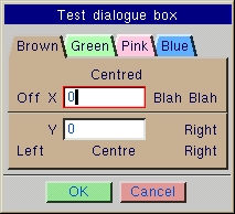
There are numerous special characters that are used in the creation of dialogue boxes, some of which have been demonstrated already in this chapter. The inclusion of special characters mean that more features and design effects are to be implemented in the dialogue box, for example alignment of text. The table below describes the function of each special character: |
|
|
|
The above script creates the dialogue box shown below: |
 |
|
Both 'Num's are effectively centred over the edit fields beneath them, by putting |- on either side of them. But after the first 'Num', notice that there is also a space after the following }: if this space did not exist, then there is no item within the following alignment tab and the 'Num' would have been centred over the next three alignment tabs instead. |
|
Note the use of fills between buttons, to spread them out to the measure. A line containing |- on its own will work just like a - , but will leave a space at either side. |
3.1.1 |
Separator lines |
|
A separator groove or ridge line can be drawn across the dialogue box. This is done by including a line that contains just a single hyphen character for a groove or two hyphens for a ridge. Arbortext APP's dialogue boxes have a separator groove line following the title and another before the exit buttons at the bottom and occasionally elsewhere where needed. |
|
The example below defines a grooved line that can be used to separate sections in a dialogue box: |
|
3.1.2 |
Icons in dialogue boxes |
|
Icons can be included within dialogue boxes. The normal use of these will be within a radio button list, where you can mix and match with normal radio buttons i.e. %r. The basic syntax is that if the first text within the [ ] is in quotes, then it is an icon name to be used on the button. It is possible to have normal text on the button which by default will be positioned underneath the icon, by inserting a colon : following the icon name, the text will be placed to the right of the icon. |
|
Colours can be used on the buttons as normal within the ( ) and these come before the icon name. The extension to this is that a colour of -1 for the background, will result in no background being drawn at all and just the icon being shown i.e: |
|
|||
|
Gives a button with the "file_o" icon on it. |
|
|||
|
Just displays the icon. |
|
To use an icon in the text proceeding a checkbox, so that the icon can also be clicked on to trigger the check, follow the example below: |
|
|||
|
The icon is a hidden radio button that is linked to the checkbox by virtue of using the same variable and the 'P's. |
3.2 |
Dialogue box groups |
|
Groups allow for items within a dialogue box to be grouped together and form an item of their own, similar to a mini dialogue box. All the abilities to centre, flush left or right etc. are valid within these groups and it is also possible to highlight them by colour and/or a border. |
Some characteristics of dialogue box groups include:
|
3.2.1 |
Group Start commands |
|
The three main group types are as follows: |
|
3.2.2 |
Other group commands |
|
Any one of the Group start commands starts a group. Subsequent text is then processed as per a normal dialogue box until one of the following occurs: [[hgroup]], [[vgroup]] or [[tgroup]] start a nested group, within the current one. |
|
|
The main dialogue box is itself a [[vgroup]] with the f option specified (see below), so [[tab]] can be used to start a new tab if required. |
3.2.3 |
Miscellaneous Group Options |
|
After the main keyword and prior to the ]] it is possible to specify any number of the following options, most of which are accumulative, but some of which cancel out earlier options. Some of these options have different effects for the three types of group, which are detailed. Also note that it is case sensitive. |
|
|
[[tab XR(-1,-1,-1,-1)m(0,0,0,-1)]] |
|
The current [[tgroup]] margins are as follows: |
|
for "x1": |
|
[[tgroup R(-1,0,0,-1)m(0,1,6,0)]] |
|
for "x2": |
|
[[tgroup R(0,-1,0,-1)m(0,1,6,0)]] |
3.2.4 |
Boxed Group Options |
|
Below are examples of syntax and the resulting display of the Boxed Groups Options. |
3.2.4.1 |
Example 1 - Indented by raised border thickness box group option - i |
|
|
The above example creates the following dialogue box: |
 |
3.2.4.2 |
Example 2 - Outdented raised border thickness box group option - o |
|
|
The above example creates the following dialogue box: |
 |
3.2.4.3 |
Example 3 - Groove surround box group option - g |
|
The groove around the dialogue box is specified by 'n' pixels down and then 'n' pixels up, where 'n' is one less than the raised border thickness. |
|
|
The above example creates the following dialogue box: |
 |
3.2.4.4 |
Example 4 - Ridge surround box group option - r |
|
The ridge around the dialogue box is specified by 'n' pixels up and then 'n' pixels down, where 'n' is one less than the raised border thickness. |
|
|
The above example creates the following dialogue box: |
 |
3.2.5 |
Boxed Group Options |
|
Fill options within groups are relatively complicated, but they enable extra control over the size of groups so that you can make several groups all the same size. |
|
|
The example below shows four dialogue boxes containing grooved [[vgroup]], with a space either side of the group. The first uses [[vgroup g]], the second [[vgroup||g]], the third [[vgroup ||fg]] and the fourth, [[vgroup ||g]][[tab ||]] to give the same effect as the third. |
|
The fourth variant would be needed if [[hgroup]] was used instead, as the 'f' option only affects vertical size for [[hgroup]]. |
 |
 |
 |
 |
3.2.6 |
Group titles |
|
Normal groups and tabs can also have titles, by specifying either 'T' or 't' within the group parameters. They are very similar to the main titles, but have some extra features: |
|
The title includes all items up to the next return character, which must be present. These titles are allowed to contain % items, help buttons and [ etc. If they are present they will just make the title taller and can be used in the normal way. A particular use of this may be to have a checkbox on the title, which disables the group contents using an internal [[tgroup]] See also Tabbed groups |
|
|
The colours for the title can be overridden by specifying [bcol],[tcol]), immediately after the 'T' or 't'. [bcol] is the background colour for the title bar for a 'T' or the background colour for the text in a 't'. [tcol] is the colour of the text itself within the title. |
|
Group titles can also be applied to [[tab]], the only restriction being that [[tab]] within a [[tgroup]] cannot have 't' titles. |
|
The following example shows the main title and group titles 'T', 'T' with '-' and 't': |
|
|
The above example creates the following dialogue box: |
 |
3.2.7 |
Tabbed groups |
|
Tabbed groups are special and enable overlayed tabs where only one is displayed at any one time. These can be used to section data into manageable portions, to show different data for options or even to hide data when certain options are turned off. |
|
After the [[tgroup]] command, Arbortext APP will read up until the next [[ and will take what it finds in between as the control and buttons that are to be placed at the top of the [[tgroup]] |
|
This must include a %T command, which is passed a variable controlling which tab to display. It works almost identically to a %r and takes an optional list of buttons in the normal fashion, along with low and high range, options ('o' & 'O') and change procedure ('P' or 'p'). |
|
Other than the %T command, the only other things allowed, are the buttons themselves in [], spaces, carriage returns and possibly a named variable prior to the %T, if in a script, or not wanting to pass a parameter to control the displaying tab. |
|
Tabbed groups do not need to have a row of tab buttons at the top, but the %T must still be present. When there are no buttons, the tab being displayed can be controlled by other editable fields (usually radio buttons). The same variable must be passed to both and a 'P' or equivalent specified on the other control so that when it changes, the tabbed group does too. |
|
If tab buttons are used, then these can be specified in several rows if required and when a new tab is brought to the front, the rest of the tabs will rotate. Also in the case of multiple rows button, it is possible to click anywhere on tabs that are visible. |
|
By default the tab buttons will overlap slightly. If you want space between them it is possible to use spaces. If you want to spread out the buttons to fill the width of the group, specify the 'f' option. |
3.2.7.1 |
Error handling |
|
Error handling within tabbed groups works in two different ways depending on whether the [[tgroup]] has buttons. If the default is not what you require then you can switch to the other method by specifying 'O' as an option to the %T. |
|
3.2.7.2 |
Greyed out tabs |
|
By default, when the variable controlling the tab has a value outside of the range of tabs, no tab will be displayed at all. It is possible however, to specify a default tab to be displayed in this case, but it will be 'greyed out'. This means that all the colours within the tab will be washed out and it is not possible for the user to click in any item within the tab, or change any data. |
|
To specify a 'grey tab', a parameter must be given to specify which tab to use and the 'o' option must be specified for the %T as follows: |
|
|
Greyed out tabs will normally be used when there is no row of tabs at the top of the tabbed group, but when the tab is controlled by an external set of radio buttons or more likely, by a checkbox. |
|
The following is an example with a checkbox is shown below, with the checkbox selected on the left and deselected on the right showing the 'greyed out' tab. |
|
|
The above example creates the following dialogue box: |
 |
 |
|
The [[tgroup]] is nested within an [[hgroup]] which contains the title. |
|
3.2.7.3 |
Tabbed group examples |
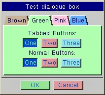
Standard tabbed group with one row of buttons |
|
This section provides examples of syntax and the resulting display of 'tabbed groups', comprising the common elements used in dialogue boxes. |
|
Notice that the colours are specified for each individual tab, they can also be specified on the [[tgroup]] buttons instead. Also the tab buttons do not stretch all the way across the group. To achieve this, [[tgroup f]] would be used instead. With this option, if any of the tab-buttons had been wider than any of the tabs, the overall width of the tabbed group would have expanded to accommodate them. Notice also the use of named variables, so this can be run as a script. |
|
|
The above example creates the following dialogue box: |
 |
 |
 |
 |
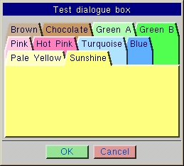
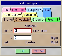
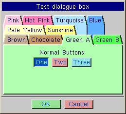
Standard tabbed group with multiple rows of buttons |
|
Note the range specified on the %T, that the tab--buttons now control the colours, rather than the tabs and that there are more tab-buttons than actual tabs (which give empty tabs which could be used when no extra data is needed). |
|
Notice also the effect of the rows themselves being cycled round when tab-buttons are selected and that tab-buttons like the 'Blue' in the first example, can be clicked on anywhere where they are not covered up! |
|
|
The above example creates the following dialogue box: |
 |
 |
|
or filled [[tgroupf]] |
 |
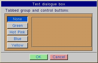
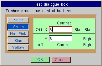
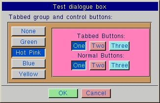
Tabbed group controlled by radio buttons |
This section provides an example of a tabbed group controlled by radio buttons. Listed below are a few points to note in this example:
|
|
|
The above example creates the following dialogue box: |
 |
 |
 |
 |
 |
3.3 |
Dialogue list treeview |
|
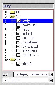
From version 8 the list treeview is intended for listing structured data that is arranged in a tree-like hierarchy. Windows users will be familiar with this type of control already as it is used extensively in Windows Explorer and is provided in the Microsoft Common Controls library for Windows. Arbortext APP's treeview control attempts to conform to the Microsoft treeview standards (in terms of interface and interaction) as much as possible. |
Syntax
|
branch:s |
Name of branch node* |
leaf:s |
Name of leaf node*+ |
elemsep:s |
Character(s) separating node names. Default character: colon ":" (#58) |
nodesep:s |
Character(s) separating nodes |
3.3.1 |
Interface |
|
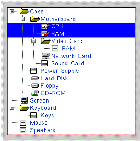
The interface of listbox treeviews is designed to be intuitive, facilitating and as familiar as possible. The following screenshot shows a sample multi-select list tree, generated from the source data given below. Nodes that are selected are shown with a red tick, branches by default cannot be selected, unless the "Branches Return Result" flag is set. |
 |
|
|
Note that certain icons have been overridden using the ((icon.name))syntax. |
3.3.2 |
Interaction |
3.3.2.1 |
Mouse |
|
The user may use the mouse to open and close branches of the tree or select one or more items in a tree. The following table describes the supported interactivity: |
|
|
3.3.2.2 |
Keyboard |
|
All standard listbox keystrokes work identically. The special treeview keys are listed below and can be remapped by supplying the listed keyname to the '***' macro. Within a treeview listbox, a key which is mapped to one of the "dbtree…" actions will take precedence over any generic dialogue mappings. |
|
Refer to the following Key Table for a list of treeview specific keystroke names, default mappings and description. Key names with a value of -1 are unmapped. |
|
3.3.2.3 |
Limits |
|
3.4 |
Embedded Dialogues in Toolbars |
|
|
|
The dialogue to be embedded must be contained within a numbered string. Dialogue boxes contained within text streams are not supported targets for embedding. Dialogues may be embedded using the Toolbar Editor macro tooledit. The screenshot below shows a |
 |
3.4.1 |
Embedded dialogue behaviour |
|
Clicking within an embedded dialogue or any of its controls will cause the dialogue to become active just as if it were a modeless dialogue. (See Modeless Dialogue Boxes). All macros will pass through the modeless dialogue before being handled by the rest of Arbortext APP, for example, @ (insert) macros will insert text into embedded text fields. The dialogue only becomes inactive when another dialogue or the main document is clicked on. |
|
An embedded dialogue can never be closed unless its parent toolbar is removed. |
3.4.2 |
Guidelines for embedded dialogues |
|
There is currently no method for creating one dialogue which will work equally well when embedded in either a vertical of horizontal toolbar. It is best to decide the orientation of the target toolbar in the early stages of using embedded dialogues. |
|
When creating a dialogue for embedding, you will want to keep the physical dimensions to an absolute minimum; to this end, |
|
Avoid using groups or tabs, these add extra space which may not be desirable. |
3.4.3 |
Scripting enhancements |
Information on the current context of the dialogue can be accessed in two ways:
|
|
Both forms above return the value of 1 if the dialogue is embedded, 0 if not. |
The wdbmi "getparms" syntax has been extended for embedded dialogues as shown below:
|
|
Only a limited subset of the [[parms]] syntax is interpreted for an embedded dialogue, however the full set will be used when an unlocked embedded dialogue is dragged off the toolbar to create a modeless dialogue. The allowable subset for embedded dialogues is as follows: "class", "resize", "store", "parentwh" and "instances". This subset also applies to wdbmi "setparms" calls which target an embedded dialogue. |
|
The behaviour of other wdbmi commands which target an embedded dialogue is also affected: |
|
"c", "s", "h", "e" and "d" will not work. |
3.4.4 |
Differences between embedded dialogues and standard dialogues |
Below is a summary of the basic differences between embedded dialogues and standard dialogues:
|
3.5 |
Help links in dialogue boxes |
3.5.1 |
Help tabs |
|
The use of tabbed groups within help dialogue boxes enables related help items to be placed together within a single dialogue box and a single string. To give a consistent interface it is suggested that all tabbed groups are given colour 40, the use of [[tab oc(40)]] at the start of each tab. |
|
To support tabbed groups some enhancements have been made to the help system as follows: |
|
|
An example of Help-tabs in use can be seen in the help-box for vertical justification, string number 601. in the shuk.3ad file. |
3.5.2 |
Help text |
|
Help buttons now default to a |
|
?601,5,Help? |
|
The above syntax will produce the button: |
|
The tab number is optional and may be missed out as long as the text for the button does not start with a digit. |
4 |
Advanced section |
4.1 |
Labelling edit fields |
|
An editable field is any item in a dialogue box which enables interaction such as buttons, text fields, sliders Editable fields within dialogue boxes can now be given a label, which enable them to be referenced by other fields and certain actions taken, whenever a specified field is changed by the user. |
|
Labels and actions are specified within [ ] immediately after % signs and preceding the range, type and options of an editable field. |
Syntax
|
*: |
Can only be used for one field within a dialogue box. It specifies that the actions for this field are performed when the dialogue box is first created, as well as calling any procedure associated with the field. |
@: |
This specifies that the supplied list of actions should be applied to all the following editable fields as default actions. The '@' symbol applies per action type. The default actions are overridden on any or all of the following editable fields if any actions are specified for the given action type. |
label:n |
A number from 0 to 99 and enables this field to be referenced and therefore changed by other fields. See also action below. |
action:n |
Are always specified by a single character, normally followed by a label which specifies which field to affect. Actions can optionally be separated by commas. Quite a number of the actions depend on the value of the working field which is initially the field that you are on, but which can be exchanged by using the 'x' action.
The various actions available are as follows:
Tag related actions:
The full list of 3B2 tag types can be found in the 3B2 Tag types chapter. |
||||||||||||||||||||||||||||||||||||||||||||||||||||||||||||||||||||||||||||||
S [label]: |
Evaluates whether the current field contains a tag name that is a script. Sets the value of the field specified by label to 1 if true or 0 if false. |
X[label]=<function>: |
Provides extended special functions. Valid functions are: 0 Changes labelled treeview the output mode of the listbox to the value of the current field . |
4.2 |
Assigning keys to fields using actions |
|
When specifying a list of actions for a field, it is also possible to assign a key to the particular field. An example of this would be to make the PageUp and PageDown keys move backwards and forwards through a tabgroup or to create a shortcut key to do any number of actions. |
|
|
When the corresponding key is pressed within the dialogue box, Arbortext APP will treat this field as though it has changed. In other words, any actions for the current field will be processed. In addition, if this field is editable, Arbortext APP will move the cursor to it (which will be the sole result if no actions exist). |
|
As a result, you can program a Ctrl Key to do anything that can be done by a list of actions. If you have no existing fields that you want the key to emulate, then you can always attach a list of actions to a dummy field '%d'. |
|
Examples of use, would be to program a key to exit a dialogue box with a result value, for example the following syntax will program Ctrl + B to exit the dialogue box with value '4': |
|
%[kbe4]d |
|
Note use of '%d' to give a dummy field on which to 'hang' the actions, that has no visible effect on the dialogue box. |
|
Another useful example may be to assign Ctrl + T to cycle through a list of tabs, using the + action. See also Tabbed groups. |
|
The following keys already have reserved meanings and cannot be reprogrammed: |
|
|
All of the above keystokes are now configurable using the * macro in the swkdefuk.3ad. |
|
It is also possible to assign fields to the PageUp and PageDown keys using 'k-' and 'k+' respectively. |
|
These keys have set uses in a list box and will not work if a list box is the currently highlighted field, but otherwise they will work as the other programmable Ctrl keys. A good use of PageUp and PageDown would probably be to cycle round the tabs of a large tabbed group. |
4.3 |
Verifying fields |
|
The 'V' option enables the contents of fields to be verified according to varied criteria. This gives a high level of control over validation of input data i.e it is not possible to click |
Syntax
|
test:s |
The [low], [high] etc. have varying use depending on the [test]. You can specify as many [test]s as you want, the field will be tried against each one in turn until one fails or until they have all succeeded. (see @ for the exception).
|
4.4 |
Lists and Combo boxes |
|
This section will provide the user with the information required to create lists in dialogue boxes. The difference between general lists and combo boxes is simply size. A combo will display just one element with a list being displayed from the down arrow for example a font list. A general list can be any size but will normally have a scroll facility for example a list of tags in the Browse Tags dialogue box. |
4.4.1 |
List Box - basic syntax |
Syntax
|
across:ndown:n?
]? list type:noptions:n? |
across:n |
Is the width to make the list box specified in the same units as most, widths for %s etc. (default 5) |
down:n |
Is the number of lines deep to make the list box. (default: 4 ) |
o: |
An optional single letter 'o', indicates the list elements are going to be inline and the !! section is not needed. |
list type:n |
Indicates how to generate the list box elements. The list type indicates the way in which the list box or combo box generates its list of elements. This is often modified by using the options and in particular the 'p' option, the parameter string. The type takes the following format:
|
options:n |
The options follow on from the basic list box type and can occur in any order, optionally separated by commas or spaces. Unrecognised characters will be ignored, but should not be used as they may have meaning in the future. The options are as follows:
|
4.4.2 |
Combo Box - basic syntax |
Syntax
|
low:n |
Not normally needed unless the details of the elements for the combo box are specified in-line which will be detailed later. |
high:n |
Not normally needed unless the details of the elements for the combo box are specified in-line which will be detailed later. |
across:n |
Is the width to make the list box specified in the same units as most, width's for %s etc. (Default 128 so must be specified). |
down:n |
Is the number of lines deep to make the list box. (default : 5). |
o: |
An optional single letter 'o', indicates the list elements are going to be inline and the !! section is not needed. |
list type:n |
Indicates how to generate the combo list elements, see below. |
options:n |
Are optional and will be explained later. |
4.4.3 |
Editable Combos |
|
Editable combos are very similar to normal combo boxes, but in addition to the ability to select the element from a list, the user can also type. The low..high are used to specify the minimum and maximum length of the string that the user can type. |
4.4.3.1 |
Elements |
|
Elements within list boxes consist of two halves; what is displayed to the user and what is written to the variable. They need bear no resemblance to each other, so provide a useful way of interacting with the user when a cryptic result is required. |
4.4.4 |
Radio Combos |
|
In addition to the normal Combo boxes, it is also possible to use radio combos. These differ from normal combo boxes in that the variable passed is a number rather than a string and by default they take their elements in-line. |
4.4.4.1 |
Radio Combo Box basic syntax |
Syntax
|
low:n |
Specifies the return value of the first element. |
high:n |
Normally specifies the return value of the last element, but in actual fact it specifies whether the elements count up or down from low. |
across:n |
Can be specified as for a List box or Combo box, but if missing, the Radio Combo will be just large enough for the widest element. |
down:n |
Defaults to however many elements you have, but can be specified if you prefer. |
elem:n |
Each element would normally just consist of the text to display to the user and the range specified by low..high dictates the return value to be used. The return value can be overridden if required then the syntax for an elem would be: [displaytext|integer_result] |
o: |
The optional letter 'o', has the reverse effect to that of list boxes and combo boxes. It indicates that the elements are not going to be inline, but use the following syntax instead: list type [options] If this format is used, it is imperative that the elements all contain integer results. In addition, across will need to be specified in this case as it will not be measured. |
4.4.5 |
In-Line elements |
|
List boxes and normal combo boxes can also be given a list of in-line elements in the same way as a radio combo, but the 'o' option has to be specified with the L, C or R to indicate that the elements are going to be inline. |
|
They are specified in the same way as for a radio-combo box, but as they both work with string variables, each element must have the following syntax: |
|
[displaytext|result_string] |
4.4.6 |
List box regenerating |
A list box will regenerate its list of elements under certain circumstances:
|
4.4.7 |
Escape codes and icons within list box elements |
|
Within the display part of a list box element it is possible to include more than straight text. Within (( )) you can place special escape codes, or an icon name which will then be placed within the list box. This is how icons are placed within the directory list and also how colour changes are achieved. |
4.4.7.1 |
Icons |
|
((icon name)) will insert the named icon at that point in the text, allowing the correct space for its width and centring it within the line vertically. Best results will be used with 'Char Icons', as then Arbortext APP will pick the correct size of icon for the text. |
|
For example, ((file_c)) will give you the closed file icon and ((file_o)) will give you the open one. |
4.4.7.2 |
Escape sequences |
|
These are numerous and all start with '31' and then a 'Sub-code' and optional data as follows: |
|
4.5 |
Modeless Dialogue Boxes |
|
During the history of Arbortext APP, dialogue boxes have always been "modal". This refers to the fact that once a dialogue box is created on the Arbortext APP system, the main interface and any other previously active dialogue is rendered inactive and will not interact with the user. "Modeless" dialogues, on the other hand, will not disable any other element of the system when they are made active, for example, a user can be working on their Arbortext APP document while a Font Properties dialogue floats over the Arbortext APP window. This feature brings with it some new macros and advanced levels of dialogue scripting (including inter-window communications), which is detailed in the remainder of this section. |
4.5.1 |
Identifying a Modeless Dialogue |
|
A modeless dialogue acts much differently to modal dialogues. Modal dialogues remain on the screen until the user clicks an exit button, which closes the dialogue and returns an exit code in the ^wdb variable. Modeless dialogues remain on the screen for an indefinite period and do not return an exit code. Interaction is performed through new scripting commands and special macros. The interaction macro is wdbmi. |
|
Scripts can be attached to modeless dialogues using the [[scripts]] syntax: + "alias", "APPLY (n/a)", "UPDATE (n/a) + ON_CLOSE (n/a). |
|
Modeless dialogues have a unique title bar colour to aid the user in recognition of a modeless dialogue. By default the colour of the title bar is a shade from 10% Magenta to 100% Magenta. Setting Arbortext APP to use Windows colour values does not affect the modeless dialogue colours. The colour index numbers which can be customised in the scol*.3ad files are 200 and 201. |
4.5.2 |
Modeless Dialogue Invocation |
|
Invocation of modeless dialogues is performed using an identical syntax to standard modal dialogues. Either of the following two examples of syntax may be used: |
|
|||
|
Creates a modeless dialogue from string number num. |
|
|||
|
Creates a modeless dialogue from text stream stream. |
|
For either of the above invocations, the ID of the new dialogue is returned in the user-space wdbm variable. Dialogue IDs are unique to each dialogue box instance and are important for advanced scripting. |
4.6 |
Advanced Dialogue Scripting |
4.7 |
Introduction |
|
Dialogues of either type may now have scripts or macros attached to dialogue exit/apply codes. For example, the user clicks the |
4.7.1 |
Syntax |
|
To open a scripting section, use the "[[scripts" directive on a line of its own at the end of the dialogue string you wish to attach scripts to. All lines of text are interpreted as scripting commands up to the final close scripting directive "]]". |
|
The following scripting commands are defined:
|
|
|
|
Note that scripts are not executed automically and can be interrupted by user input between lines of the script. A good idea would be to group macros that need to be atomic using the ":" macro concatenation character (as shown in the example). The example update command uses a script as an example action, but in the real world should be optimised by changing the action to a macro call: |
|
|||
|
Also note that multiple apply, alias, autoexec, autoexit, update and on_close commands can be defined. You can also define multiple scripts or macros to apply to the same exit/apply code. The scripts will be interpreted in order of definition. |
4.7.2 |
Creating an Apply Button |
|
A new dialogue element modifier has been implemented to enable dialogue elements to "emulate" an exit/apply code. In effect, when the value of an element changes, the apply command(s) for a certain exit code are processed. When this feature is used in combination with a radio button we can create an |
|
The new modifier is of the syntax: |
|
|||
|
Where x is the exit/apply code to emulate. |
|
It is important to note that this modifier is a variant of the standard "p" modifier, which has no brackets. The standard "p" modifier is used to attach a C callback function to a dialogue element and should never be used from Arbortext APP scripting. |
|
Borrowing from the earlier example: |
|
|||
Below the separate elements of the above syntax it will be easier to see exactly what the syntax is achieving:
|
|
Of course one may script their own exit/apply codes which are not even linked to an exit button, which opens a whole world of possibilities in terms of flexible dialogue scripting. The Apply button is simply one use for the "p()" element modifier. |
4.7.3 |
Inter-Window Communication |
|
Inter window communication is controlled with the wdbmi macro. |
4.8 |
Resizable Dialogue boxes |
|
|
|
Scripting is only available for modeless dialogues. |
4.8.1 |
Identifying resizable dialogue boxes |
|
It is simple to identify a resizable dialogue box. Arbortext APP follows the Windows convention of drawing a "widget" in the lower right-hand corner of the dialogue box as shown in the image below: |
 |
4.8.2 |
Using resizable dialogue boxes |
|
Resizable dialogues work in identical fashion to current non-resizable dialogues, the main exception is when the user left-clicks and drags at a corner or edge of the dialogue window. This causes the window to grow or shrink as the user moves the mouse, until the user releases the mouse button. |
|
There is currently no keyboard interface to resize a dialogue box. Also note that resizable dialogues cannot shrink smaller than the minimum size required to display all the dialogue elements. |
4.8.3 |
Creating a resizable dialogue box |
|
Constructing a dialogue which looks and feels correct when resized requires a bit more thought than traditional dialogues. The first thing to remember is that, by default, the dialogue groups and items will try to squeeze into the smallest possible space. To create a resizable dialogue where the elements actually grow and space out requires the use of horizontal and vertical fills. |
|
There are three different types of fills available for use within a dialogue box as described below: |
|
|
The screenshots below show examples of different fills: |
|
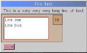
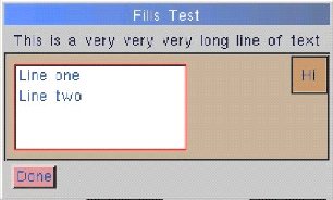
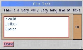
Example of no fills: |
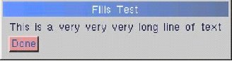 |
|
Example of horizontal inter-item fill before |
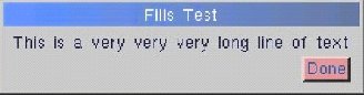 |
|
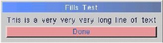
Example of horizontal item fill applied to the |
 |
|
There are a few points to consider when planning a resizable dialogue. The primary concept behind building a resizable dialogue is that extra fill space due to a resize must be passed down hierarchically through the groups to their tabs and then within the tabs to inter-item and item fills. Vertical or horizontal fill space can be allocated independently of, or in conjunction with, each other. |
|
The dialogue content (after the title line) is contained within a [[vgroup f]]. This means when the dialogue is resized, the content within the vgroup will not be resized vertically unless one or more tabs are explicitly defined with a vertical fill (for example [[tab |=]]). The second point to remember is that other groups within the dialogue will not fill out unless specified. For vgroups specified with the 'f' flag, internal tabs will fill out horizontally but not vertically – to fill vertically use a tab [[tab|=]]. For hgroups specified with the 'f' flag, internal tabs will fill out vertically but not horizontally – to fill horizontally use a [[tab | |]]. Tabs within a tgroup fill out uniformly, according to the fills specified in the main [[tgroup]] instruction. A final concept to remember is that within a tab the extra space is distributed evenly amongst both item fills and inter-item fills. |
|
While developing a dialogue box it is often useful to set different background colours or borders for groups, as a visual aid. |
4.8.3.1 |
Developing a resizable dialogue |
The following describes each a step involved in creating a resizable dialogue.
|
4.8.4 |
Dialogue Item Fills |
|
|
4.8.4.1 |
Example of a dialogue item definition containing an item fill |
|
|||
|
Item fill syntax |
|
|||
|
The fills parameter can be any combination of valid fill sequences. The currently supported valid fill sequences are '||' for a horizontal fill and '|=' for a vertical fill. There are restrictions as to which fills are usable with which item types (see table). |
4.8.5 |
Extended dialogue parameters |
|
The dialogue box syntax allows for the specification of the dialogue box parameters within the dialogue string itself. The extended parameter syntax should be included at the end of a dialogue box string, before any [[scripts]] section and takes the following format. |
4.8.5.1 |
Example of a dialogue string containing extended parameters |
|
|
The valid parameter names, their allowable values and behaviour are outlined in the table below. Cells with an asterisk indicate parameters which are available across all Arbortext APP platforms. Value types of "string" are any string of characters surrounded by double quotes. Double quotes within the string data should be replaced with a two sets of double quotes. Value types of "expr" are any valid Arbortext APP expression. Any counters used in the expression are evaluated within the context of the current dialogue box, for example, 'd' for dialogue number, 'h' for parent window handle. |
|
4.8.6 |
Dialogue size and position memory |
|
As an adjunct to the resizable dialogues feature, support has been added to Arbortext APP for memory of dialogue sizes and positions. The data for this feature is stored in the Windows registry under a sub-key "Dialogues" within the main Arbortext APP key. The size and position memory is unique to each dialogue class, not a dialogue string/stream nor an individual instance of a dialogue. |
|
This feature is labelled "Save dialogue sizes and positions" and can be located within the [File/3B2 Preferences/Interface...] dialogue, under the |
|
There is also a " |
|
When the "Save dialogue sizes and positions" feature is enabled, the following behaviour is exhibited by Arbortext APP: |
4.8.6.1 |
When a dialogue opens |
4.8.6.2 |
Positioning |
|
4.8.6.3 |
Sizing |
|
4.8.6.4 |
Sizing |
|
If the "Save dialogue sizes and positions" preference is activated, or has been overridden for this particular dialogue using the store parameter, then the current size and position of the dialogue is saved to the Windows registry. |
|
The table below describes dialogue item types and which item fills are valid for each type. An 'X' indicates the fill type is valid for that item, a '-' indicates the fill type is invalid. |
|
|
5 |
Dialogue box examples |
|
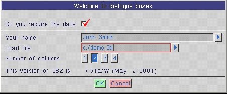
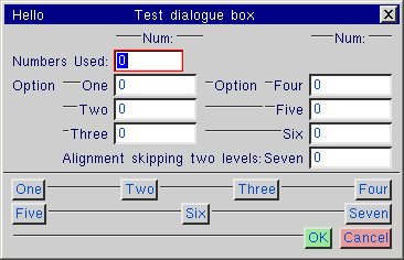
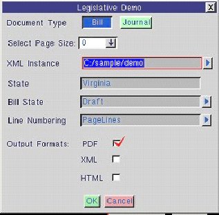
Below is a script example that includes comments to explain what each section of the script is doing. |
|
|
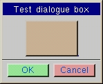
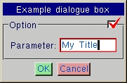
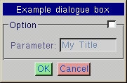
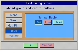
The script above creates the dialogue box shown below: |
|
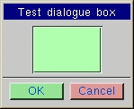
This screenshot shows the dialogue box with the |
 |
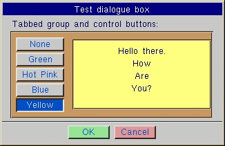
|
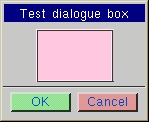
This screenshot shows the dialogue box with the |
 |
6 |
Further information |
|
Raw dialogues documentation from 3B2 programmers is available on the 3B2 installation CD. |
6.1 |
Associated documentation |
|
7 |
Subject Index |
|
Subject index only applicable to the PDF version. |
Document created on 17-Sep-2002, last reviewed on 06-Jan-2005 (revision 4)
 7.67
7.67 
 button next to an edit box. The user chooses an item from the menu and is then returned to the dialogue box itself.